| ASSESSED VALUE OF HOUSHOLD AND KITCHEN FURNITURE OWNED BY BLACK AMERICANS IN GEORGIA. | |||||
| 1875 | 1880 | 1885 | 1890 | 1895 | 1899 |
|---|---|---|---|---|---|
$21,186.00 |
|
|
|
|
|
|
|
|
|
|
|
|
|
|
|
|
|
|
|
|
|
|
|
|
|
|
|
|
|
|
|
|
|
|
|
|
|
|
|
|
|
|
|
|
|
|
|
|
|
|
|
|
|
$498,532.00 |
|
|
|
|
|
|
|
|
|
||
|
|
|
|
||
|
|
|
|
||
|
|
|
|
||
$736,170.00 |
|
|
|
||
|
|
|
|||
|
|
|
|||
|
|
|
|||
|
|
|
|||
|
|
|
|||
|
|
|
|||
|
|
|
|||
|
|
|
|||
$1,173,624.00 |
|
|
|||
|
|
||||
|
|
||||
$1,322,694.00 |
|
||||
|
|||||
|
|||||
$1,434,975.00 |
|||||
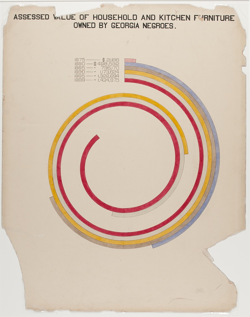
Assessed value of household and kitchen furniture owned by black Americans in Georgia.
This plate is similar to the City vs. Rural plate in that it subverts the typical bar chart through turning it into a spiral, capturing the eye and hammering home the message. In this case, the take-home message is the increase in value of the personal possessions of Black Americans by a factor of almost 68 between 1875 and 1899.
This could have been presented in a similar way to the City vs. Rural table, using a “row overflow” method of data visualisation. But, to try something different, I instead wanted to capture the feeling of having to follow those bars from their origins, forcing you to realise their true differences in magnitude. Instead of following a spiralling bar, however, I wanted to force users to scroll. I’m pleased with the way the table works — the difference between 1875 and 1899 is really highlighted (on my monitor you can’t actually see both at once due to the length of the table!).
This required some awkward hacks to appear as I wanted in the gt table, including some very unfamiliar data frame manipulations with dplyr, but it looks exactly as I wanted it to in the end.
library(tidyverse)
library(gt)
# read data
furniture <- readr::read_csv('https://raw.githubusercontent.com/rfordatascience/tidytuesday/master/data/2021/2021-02-16/furniture.csv')
# manipulate data
tbl_dat <-
furniture |>
# rescale dollars to be whole numbers
mutate(x = `Houshold Value (Dollars)`,
`Houshold Value (Dollars)` = vec_fmt_currency(`Houshold Value (Dollars)`),
x = x / min(x),
x = scales::rescale(x, c(1, 30), from = range(x))) |>
mutate(x = floor(x)) |>
# get all values, 1 to 30
right_join(tibble(x = 1:30)) |>
crossing(tibble(y = 1:30)) |>
# only have values up to the relevant row (e.g., 10 rows for `1880`)
filter(y <= x) |>
arrange(y) |>
# where row is less than target (1:9 for 1880), just put a space in
mutate(`Houshold Value (Dollars)` = if_else(x == y,
`Houshold Value (Dollars)`,
" ")) |>
drop_na(Year) |>
select(-x) |>
# reshape
pivot_wider(names_from = Year,
values_from = `Houshold Value (Dollars)`) |>
unnest(everything()) |>
distinct() |>
select(-y)
# make table!
gt(tbl_dat) |>
gtExtras::gt_theme_538() |>
cols_align("center") |>
sub_missing(missing_text = "") |>
# colour the cells to appear as a bar chart
tab_style(
cell_fill(color = "#d5a9a0"),
cells_body(1, length(na.omit(tbl_dat[,1][[1]])))
) |>
tab_style(
cell_fill(color = "#b0aebc"),
cells_body(2, 1:length(na.omit(tbl_dat[,2][[1]])))
) |>
tab_style(
cell_fill(color = "#baa28a"),
cells_body(3, 1:length(na.omit(tbl_dat[,3][[1]])))
) |>
tab_style(
cell_fill(color = "#d1a138"),
cells_body(4, 1:length(na.omit(tbl_dat[,4][[1]])))
) |>
tab_style(
cell_fill(color = "#eae9e6"),
cells_body(5, 1:length(na.omit(tbl_dat[,5][[1]])))
) |>
tab_style(
list(
cell_fill(color = "#9e3844"),
cell_text(color = "white")
),
cells_body(6, 1:length(na.omit(tbl_dat[,6][[1]])))
) |>
fmt_markdown(everything()) |>
cols_width(everything() ~ px(120)) |>
tab_header(
toupper("Assessed value of houshold and kitchen furniture owned by black americans in Georgia.")
) |>
tab_options(heading.align = "center")