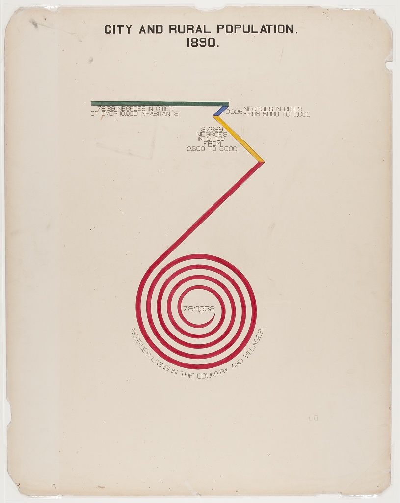
| URBAN AND RURAL POPULATION. 1890. |
||
| Category | Population | |
|---|---|---|
| Cities Over 10000 | 78139 |  |
| Cities 5000-10000 | 8025 |  |
| Cities 2500-5000 | 37699 |  |
| Country and Villages | 734952 |  |
|
||
|
||
|
||
|
||
|
||
|
||
 |
||
Occupations of Black and White Americans in Georgia.
This plate shows the number of black Americans who live in urban and rural environments in 1890. There is almost a order of magnitude more black Americans living in the countryside than there are in cities.
This infographic is unusual in appearance, and much has been said about its almost modernist style. While it starts as a regular bar chart with the green line representing large cities, it suddenly juts off at an angle, culminating in an absurdly large spiralling bar. The message I take from this is that the difference between the categories is so stark that it defies the traditional structure of the medium (in this case, the bar chart). This defiance is what I want to carry over to the tabular format.
To express this idea in a gt table, I’ve used a pretty typical in-line bar plot, but allowed it to spill over onto rows below. I think this nicely presents the message of “this value is almost comically large compared to the others” nicely. The mathematical transformations to get this result were interesting to write, and made good use of the lesser known tidyr::uncount() function.
library(tidyverse)
library(gt)

# read data
city_rural <-
  readr::read_csv(
    'https://raw.githubusercontent.com/rfordatascience/tidytuesday/master/data/2021/2021-02-16/city_rural.csv'
  )

# format for table
tbl_data <-
  city_rural |>
  mutate(
    Category = fct_inorder(Category),
    n = Population / 100000,
    n_ceil = ceiling(n) # n_ceil = number of "100000" chunks
  ) |>
  arrange(Category) |>
  uncount(n_ceil) |> # uncount - get a row per 100000
  mutate(val = if_else(n < 1, n * 100000, 100000)) |>
  group_by(Category) |>
  mutate(rn = row_number(),
         val = if_else(rn == max(rn),
                       100000 * (n - floor(n)),
                       val)) # final row per group should be remainder of Population

# function to create bars
plot_bar <- function(data, color) {
  data |>
    ggplot(aes(y = "", x = val)) +
    geom_col(fill = color) +
    expand_limits(x = 100000) +
    theme_void()
}

# create plots
plots <-
  tbl_data |>
  group_by(Category, rn) |>
  group_split() |>
  map2(.y = c("#5f7767", "#6276ab", "#e1b323", rep("#b82a40", nrow(tbl_data) - 3)),
       plot_bar)

# create table
tbl_data |>
  # drop repeat values
  mutate(
    Category = if_else(rn == 1, as.character(Category), ""),
    Population = if_else(rn == 1, as.character(Population), "")
  ) |>
  ungroup() |>
  select(Category, Population) |>
  mutate(plots = NA) |>
  gt() |>
  gtExtras::gt_theme_538() |>
  cols_label("plots" = "") |>
  tab_header(html("URBAN AND RURAL POPULATION.<br>1890.")) |>
  tab_options(heading.align = "center") |>
  text_transform(cells_body(plots),
                 function(x) {
                   ggplot_image(plots, height = px(20), aspect_ratio = 9)
                 })