Tabulating DuBois
![]()
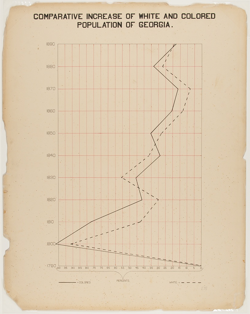
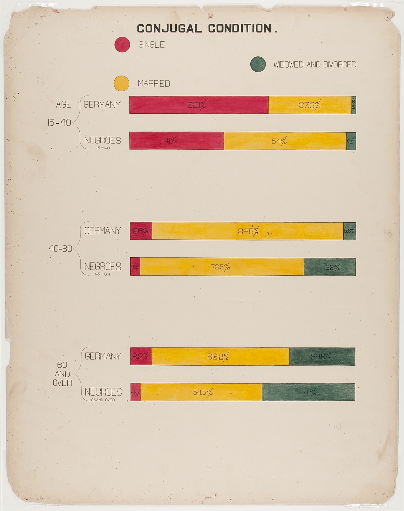
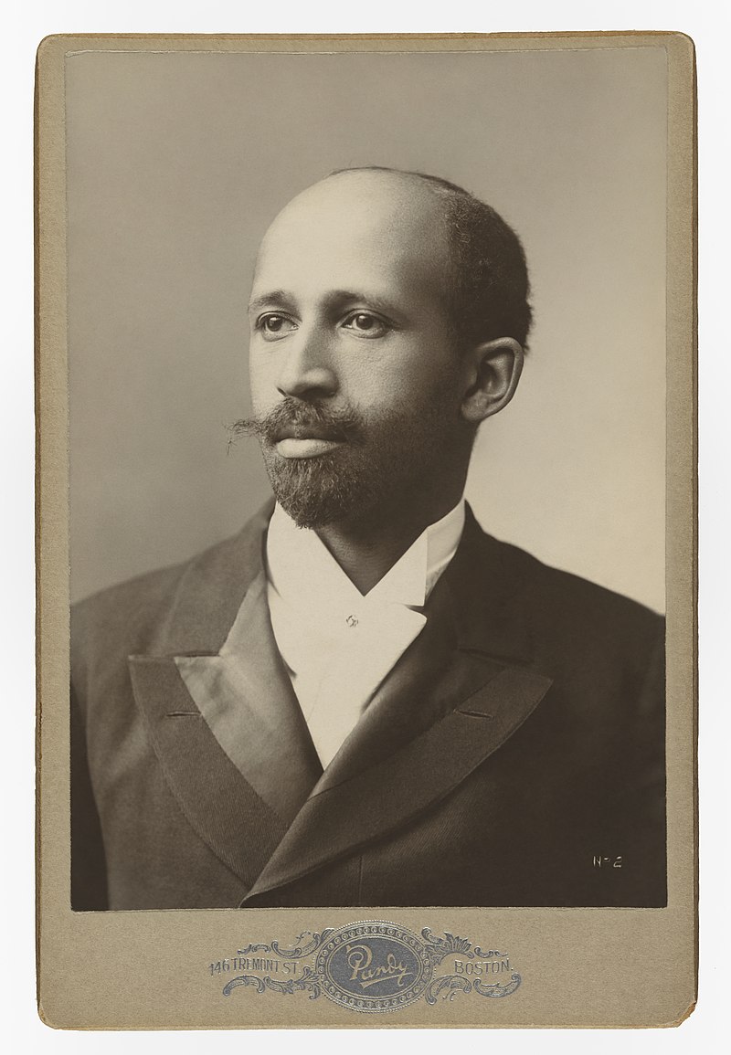
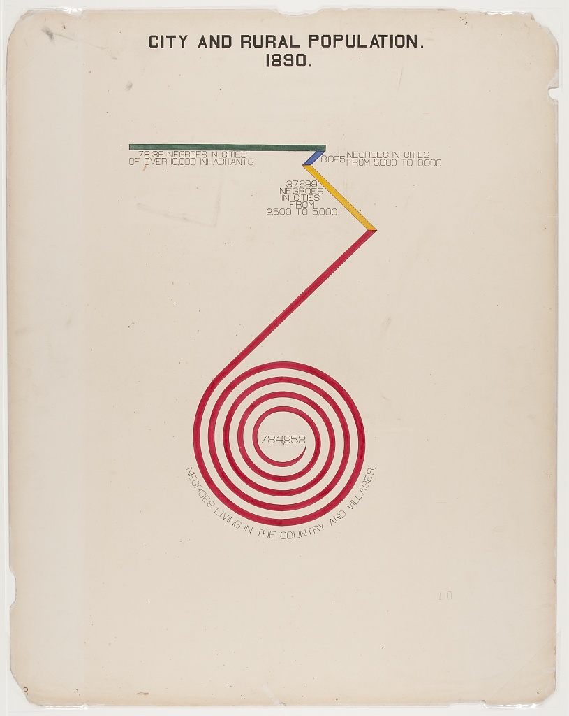
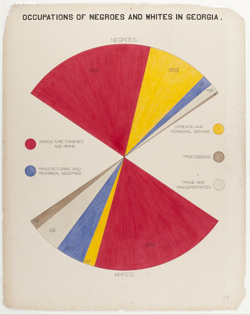
W.E.B. DuBois was a trailblazer in many ways, and is known for his use of data visualisation to challenge the racism of the early 20th century.
DuBois’ work makes me think of contrast, both in its topic and style. It contrasts the lives of white and black Americans in his day. It is obviously hand-drawn, yet still meticulously neat. It is immediately familiar in its basic geometry, but subverts expectations as the shapes loop, spiral and fan.
DuBois can teach us about race in the 20th century, but he can also teach us to play with the expectations of the media with which we present data to tell more impactful stories.
The DuBois Challenge
The DuBois Challenge is described by Anthony Starks in his #DuBois Challenge Write-up:
In February 2021, people on Twitter were challenged to re-create the historical data visualizations of W.E.B. Du Bois. The goal of the challenge was to celebrate his data visualization legacy by recreating the visualizations showcased at the 1900 Paris Exposition using modern tools.
Many folks submitted their attempts, often realising (as I did!) that re-creating hand-drawn, centuries-old data visualisations are surprisingly difficult, even with modern tools! Many tools were used, such as Tableau, R, ggplot, Stata, PowerBI, decksh, etc, but the medium was always graphs.

Purpose
Recently, RStudio/Posit has championed the table as a data presentation format, including two past table contests, a current table contest, and the launch of the {gt} package. While tables could be considered the stuffier, less exciting cousin of graphs or maps, these recent developments have shown that tables can hold their own against other data presentation media.
The purpose of “Tabulating DuBois” is to effectively recreate the DuBois Challenge, but with tables as the medium. The key questions I’m looking to answer are:
Can DuBois’ style be effectively recreated in a tabular format?
Can the spirit of DuBois’ original panels be recreated in a tabular format?
Can DuBois teach us any lessons of how to subvert the tabular format, similar to how he subverted the data visualisation/infographic?
To explore these ideas, please navigate to the Tables Pane.
Please note that the data used on this website was originally presented by DuBois in 1900, which means it includes the use of now-offensive terms such as “colored” and “negroes” to make reference to black Americans. These terms were used by many of the participants of the 2021 DuBois Challenge as the goal was to recreate DuBois’ original plates as accurately as possible using modern tools.
The goal of “Tabulating DuBois” is not to recreate, but be inspired by. As the data is now presented in a new context and in a new medium, it did not feel appropriate to use these outdated terms. Black Americans are now referred to using the terms “Black” or, where relevant, “Black Americans” in the tables and text. DuBois’ original language can still be seen in the images of the plates shown on this website, which are displayed unaltered and uncensored.