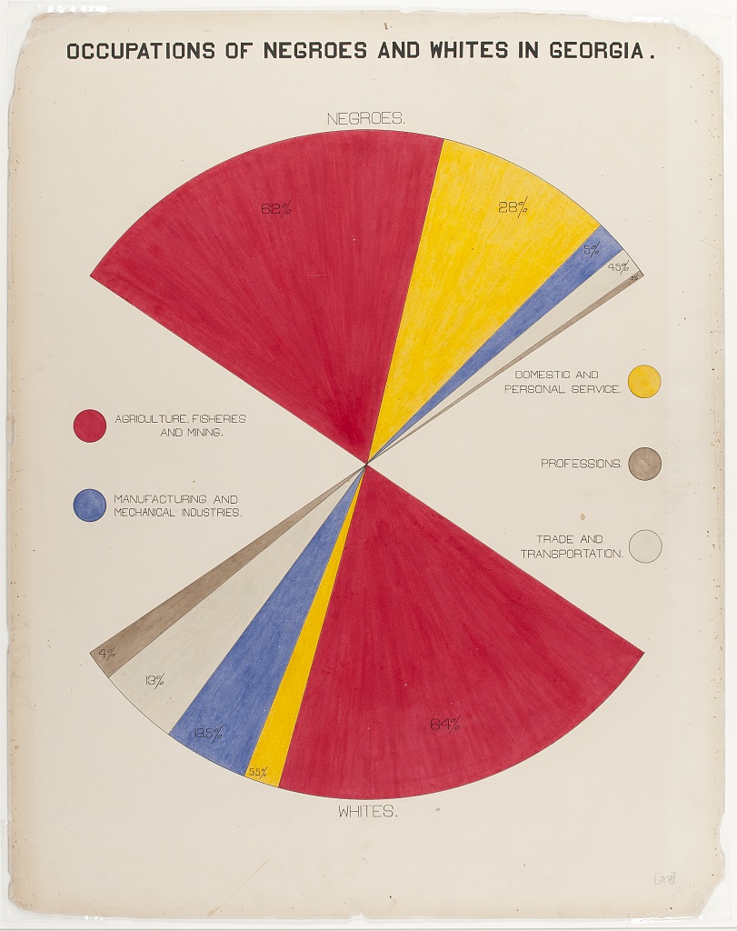
| OCCUPATIONS OF BLACK AND WHITE AMERICANS IN GEORGIA. | |||
| Occupation | Black | White | |
|---|---|---|---|
AGRICULTURE, FISHERIES AND MINING |
62.0% |  |
64.0% |
DOMESTIC AND PERSONAL SERVICE |
28.0% |  |
5.5% |
MANUFACTURING AND MECHANICAL INDUSTRIES |
5.0% |  |
12.5% |
TRADE AND TRANSPORTATION |
4.5% |  |
13.0% |
PROFESSIONS |
0.8% |  |
4.0% |
Occupations of Black and White Americans in Georgia.
This plate shows the percentages of black and white Americans employed in different industries. One of the more striking data insights is the much greater proportion of black Americans employed as domestic servants when compared to white Americans.
This is one of DuBois’ more striking graphs in appearance, with its “fan-like” shape. You can almost think of it like a pie chart with some wedges cut out. I personally found this such a unique geometry that I chose it as my contribution of the DuBois Data Challenge in 2021.
Sadly, this is quite a challenging geometry to transform into a tabular format. What I wanted to capture was the double comparison it codifies — the white percentage vs. the black percentage, but also the individual industry vs the other industries. I also wanted to capture the symmetry of the plate, and the way the plate has rotational symmetry rather than being reflected along a horizontal line (e.g., the red panels are opposite each other, creating a hourglass shape, rather than both being on the left or right of their respective wedge).
To try to capture the feel of all of this, I expressed it as what I might call “duelling bars”1 — effectively two in-line bar charts where x = 0 is at opposite sides and x = 100 meet in the middle. It is the opposite of how a pyramid population chart looks, where x = 0 is in the middle.
The end result is a lot less visually interesting than than the original plate, and I’d argue the weakest recreation. I’d be interested to see if others could interpret it more faithfully.
library(tidyverse)
library(gt)

# read data
occupation <-
  readr::read_csv(
    'https://raw.githubusercontent.com/rfordatascience/tidytuesday/master/data/2021/2021-02-16/occupation.csv'
  ) |>
  mutate(Occupation = factor(
    Occupation,
    c(
      "Agriculture, Fisheries and Mining",
      "Domestic and Personal Service",
      "Manufacturing and Mechanical Industries",
      "Trade and Transportation",
      "Professions"
    )
  )) |>
  arrange(Occupation) |>
  # language
  mutate(Group = case_when(Group == "Negroes" ~ "Black",
                           Group == "Whites" ~ "White"))

# function to create bars
plot_bars <- function(data, color) {
  data |>
    mutate(Percentage = if_else(Group == "White", Percentage * -1, Percentage)) |>
    ggplot() +
    geom_col(alpha = .25, aes(y = "", x = if_else(Group == "White",-100, 100)), fill = "grey85") +
    geom_col(alpha = .85, aes(y = "", x = Percentage), fill = color) +
    facet_wrap(vars(Group), scales = "free_x") +
    theme_void() +
    theme(strip.text = element_blank(), panel.grid.major.x = element_line()) +
    scale_y_discrete(expand = expansion()) +
    scale_x_continuous(breaks = c(c(0, 25, 50, 75, 100), c(0, 25, 50, 75, 100) * -1))
}

# plot bars
plots <-
  occupation |>
  group_split(Occupation) |>
  map2(.y = c("#b92e43", "#edc120", "#6a78a5", "#e0d5c3", "#a69077"),
       plot_bars)

# prep data for table
tbl_data <-
  occupation |>
  # reshape
  pivot_wider(names_from = Group, values_from = Percentage) |>
  mutate(plots = NA, .after = Black) |>
  # add HTML
  mutate(
    Occupation = toupper(Occupation),
    Occupation = str_replace(
      Occupation,
      "AGRICULTURE",
      "<b style='color:#b92e43'>AGRICULTURE</b>"
    ),
    Occupation = str_replace(
      Occupation,
      "DOMESTIC",
      "<b style='color:#edc120'>DOMESTIC</b>"
    ),
    Occupation = str_replace(
      Occupation,
      "MANUFACTURING",
      "<b style='color:#6a78a5'>MANUFACTURING</b>"
    ),
    Occupation = str_replace(Occupation,
                             "TRADE ",
                             "<b style='color:#e0d5c3'>TRADE </b>"),
    Occupation = str_replace(
      Occupation,
      "PROFESSIONS",
      "<b style='color:#a69077'>PROFESSIONS</b>"
    )
  )

# make table
tbl_data |>
  gt() |>
  gtExtras::gt_theme_538() |>
  cols_label(plots = "") |>
  cols_width(plots ~ px(250)) |>
  cols_align("left", columns = "White") |>
  fmt_percent(c(White, Black), scale_values = FALSE, decimals = 1) |>
  fmt_markdown(Occupation) |>
  tab_header(toupper("Occupations of Black and White Americans in Georgia.")) |>
  tab_options(heading.align = "center") |>
  text_transform(cells_body(plots),
                 function(x) {
                   ggplot_image(plots, height = px(25), aspect_ratio = 8)
                 })
Footnotes
Please let me know if there is already a term for this!↩︎