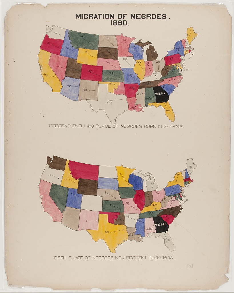
| MIGRATION OF BLACK AMERICANS. 1890. |
|||||||||||
PRESENT DWELLING PLACE OF BLACK AMERICANS BORN IN GEORGIA. | |||||||||||
| |||||||||||
BIRTH PLACE OF BLACK AMERICANS NOW RESIDENT IN GEORGIA. | |||||||||||
| |||||||||||
Migration of Black Americans in Georgia.
This plate is a map showing the migration of black Americans into and out of Georgia in 1890. On the face of it, the map is very curious — the colours don’t seem to represent anything, and the states themselves aren’t labelled1. One can intuit which one is Georgia due to it being labelled in Black, with all arrows pointing towards or away from it.
The underlying data from these two maps is very simple in structure, and it would be relatively easy to create a gt table, perhaps colouring the rows using data_color(). But this plate made me curious — could one create a map with gt? It wouldn’t be nearly as detailed as one created with ggplot2 or leaflet, but the plate doesn’t seem to care for detail as much as being eye catching, so why should the table?
By borrowing the state grid from the geofacet package, I was able to use tidyr to create a data frame where the locations of the values roughly represented the geographic positions of the states. I re-used DuBois’ colour scheme but used it to bin the data into quantiles, visually grouping states with similar values together.
This table also uses a strange quirk of gt — you can put tables inside other tables!
library(tidyverse)
library(gt)
library(geofacet)

# read data
birthplace <-
  read_csv(
    "https://raw.githubusercontent.com/ajstarks/dubois-data-portraits/master/challenge/challenge09/birthplace.csv"
  )

present <-
  read_csv(
    "https://raw.githubusercontent.com/ajstarks/dubois-data-portraits/master/challenge/challenge09/present.csv"
  )

# combine data
combined_data <-
  left_join(
    # borrow grid from geofacet
    geofacet::us_state_grid1,
    full_join(present,
              birthplace,
              by = "State"),
    by = c("code" = "State")
  ) |>
  tibble() |>
  arrange(col, row)|>
  # replace missing with 0
  mutate(across(`Present Location`:Birthplace, ~replace_na(.x, 0)))

# function to create map
create_gt_map <- function(col, n, colors){

  # get range (discounting Georgia --- off the scale)
  rng <-
    combined_data |>
    filter(name != "Georgia") |>
    pull({{col}})

  # process and reshape data
  tbl_data <-
    combined_data |>
    select(row, col, {{col}}) |>
    pivot_wider(names_from = col,
                values_from = {{col}},
                values_fn = list) |>
    arrange(row) |>
    select(-row) |>
    unnest(everything())

  # make table
  tbl_data |>
    gt::gt() |>
    # theme
    opt_all_caps()  |>
    opt_table_font(
      font = list(
        google_font("Chivo"),
        default_fonts()
      ),
      weight = 300
    ) |>
    fmt_number(everything(), decimals = 0) |>
    cols_width(everything() ~ px(68)) |>
    cols_align("center") |>
    sub_missing(missing_text = "") |>
    cols_label(`1` = "", `2` = "", `3` = "", `4` = "",
               `5` = "", `6` = "", `7` = "", `8` = "",
               `9` = "", `10` = "", `11` = "") |>
    # colour by data
    data_color(
      columns = everything(),
      colors = scales::col_quantile(
        colors,
        domain = c(0, rng),
        na.color = "white", n = n
      )
    ) |>
    tab_style(
      list(
        cell_text(color = "white"),
        cell_fill(color = "black")
      ),
      cells_body(8, 7)
    ) |>
    # options
    tab_options(
      column_labels.border.top.color = "white",
      column_labels.border.bottom.color = "white",
      table_body.border.bottom.color = "white",
      table_body.hlines.color = "white",
      data_row.padding = px(15),
      footnotes.multiline = FALSE,
      footnotes.padding.horizontal = px(50),
      footnotes.border.bottom.color = "white",
      table.border.bottom.color = "white"
    ) |>
    # footnotes
    tab_footnote(footnote = "Hawaii", locations = cells_body(1, 8)) |>
    tab_footnote(footnote = "Alaska", locations = cells_body(2, 8))

}

# create birthplace map
birthplace_map <-
  create_gt_map(
    Birthplace,
    n = 3,
    colors = c("#ebe7e4", "#d8bbb0", "#516399", "#cea345", "#9e3c46")
  )

# create present location map
present_map <-
  create_gt_map(
    `Present Location`,
    n = 6,
    colors =c("#ebe7e4", "#d8bbb0", "#516399", "#6e7261", "#cea345", "#9e3c46")
  )

# create final table
tibble(map = c(
  toupper("Present dwelling place of black Americans born in Georgia."),
  as_raw_html(present_map),
  toupper("Birth place of black Americans now resident in Georgia."),
  as_raw_html(birthplace_map)
)) |>
  gt() |>
  fmt_markdown(everything()) |>
  gtExtras::gt_theme_538() |>
  cols_label(map = "") |>
  cols_align("center") |>
  tab_header(html("MIGRATION OF BLACK AMERICANS.<br>1890.")) |>
  tab_options(heading.align = "center", data_row.padding = px(10))
Footnotes
Perhaps this is an easier sell to an American audience, but I could probably only label ten at most!↩︎