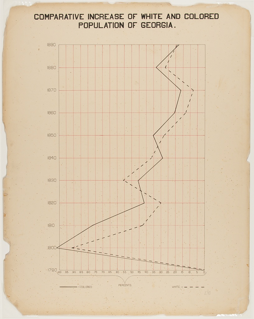
| COMPARATIVE INCREASE OF WHITE AND BLACK POPULATION IN GEORGIA. | |||
| Year |
• Black |
◦ White |
|
|---|---|---|---|
| 1890 | 21% | 20% |  |
| 1880 | 36% | 34% |  |
| 1870 | 22% | 11% |  |
| 1860 | 20% | 16% |  |
| 1850 | 35% | 31% |  |
| 1840 | 30% | 34% |  |
| 1830 | 45% | 55% |  |
| 1820 | 42% | 30% |  |
| 1810 | 78% | 46% |  |
| 1800 | 100% | 90% |  |
| 1790 | 0% | 0% |  |
Comparative Increase of White and Black Population in Georgia.
This plate shows the comparative increase of the white and black population of Georgia. It is interesting in that it is quite a straightforward time series, but the time axis is shown on the y-axis rather than the more typical x-axis.
This gave me some pause; on an x-axis, we are used to time flowing “forward”, left-to-right, but what is the best direction on a y-axis? Typically values increase as you go up a y-axis (DuBois’ choice), but instinctively I expect dates to increase as you go down as you often see in tables. My first instinct was to read the plot top-to-bottom, which was actually going back in time. I was also taken aback that the x-axis was reversed — starting at 100% and ending at 0%. Regardless of DuBois’ intention, this unusual ‘rotated’ graph demands careful attention.
To recreate this visualisation as a table, I created plots for each row which showed a dot for each of the two races shown in DuBois’ original graph. When viewed as a whole, the image of the original plate is revealed, including the reversed x-axis and ascending dates.
A gt trick I used was adding unicode characters to the column labels to act as a pseudo-legend. This should allow readers to identify what the dots actually represent.
library(tidyverse)
library(gt)
# read data
georgia_pop <-
readr::read_csv(
'https://raw.githubusercontent.com/rfordatascience/tidytuesday/master/data/2021/2021-02-16/georgia_pop.csv'
) |>
# descending "Year"
arrange(desc(Year)) |>
# language
rename(Black = Colored)
# function to create plots
plot_dots <- function(data) {
# only label 0, 50 and 100
labs <- tibble(y = rep("", 3), x = c(0, 50, 100))
# create plot
plt <-
data |>
ggplot(aes(y = "")) +
geom_vline(xintercept = seq(0, 100, 10), color = "red") +
theme_void() +
expand_limits(x = c(0, 100)) +
scale_x_reverse() # reverse x-axis
# only add labels to the first and last years
if (data$Year %in% c(1790, 1890)) {
plt <-
plt + geom_text(
inherit.aes = FALSE,
data = labs,
aes(x, y, label = x),
size = 27.5
)
}
# add points
plt +
geom_point(aes(x = Black), size = 35) +
geom_point(
aes(x = White),
fill = "white",
stroke = 4,
shape = 21,
size = 35
)
}
# use function to create plots
plots <- georgia_pop |>
group_split(Year) |>
map(plot_dots)
# create table
georgia_pop |>
mutate(dots = NA) |>
gt() |>
gtExtras::gt_theme_538() |>
fmt_percent(Black:White, scale_values = F, decimals = 0) |>
tab_header(toupper("Comparative Increase of White and Black Population in Georgia.")) |>
# dropping padding makes plots look better
tab_options(data_row.padding = 0, heading.align = "center") |>
cols_width(dots ~ px(250),
Year:White ~ px(80)) |>
# use of unicode to create "legend"
cols_label(
dots = "",
Black = html("<div style='font-size:2.5em'>•</div>Black"),
White = html("<div style='font-size:2.5em'>◦</div>White")
) |>
cols_align("center") |>
# add plots
text_transform(cells_body(columns = dots),
function(x) {
ggplot_image(rev(plots), height = px(35), aspect_ratio = 6)
})