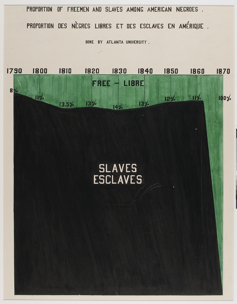
| PROPORTION OF FREEMEN AND SLAVES AMONG BLACK AMERICANS. | ||||||||
| DONE BY ATLANTA UNIVERSITY. | ||||||||
|
1790 92% | 8% |
1800 88% | 11% |
1810 86% | 14% |
1820 87% | 13% |
1830 86% | 14% |
1840 87% | 13% |
1850 88% | 12% |
1860 89% | 11% |
1870 0% | 100% |
|---|---|---|---|---|---|---|---|---|
Proportion of Freemen and Slaves Among Black Americans.
This plate shows the proportion of black Americans who were freemen across the decades from 1790 to 1870. The most striking feature of the original plate is how the proportion of enslaved black Americans remained so constant until 1870, when the abolishment of slavery came into effect.
While telling a very powerful story, the underlying data is actually very simple — it is effectively two variables (the decade and the percentage of black “freemen”). Instead of tabulating this data as-is and creating in-line visualisations (likely stacked bars), I wonder if the cells of a table itself could be used to recreate the striking geometry of the plate.
This required using gt in quite a hacky way, but I effectively created a matrix of TRUE and FALSE values which could then be coloured either green or black. This recreated the image of the original plot. Is this a particularly good table? Not really! Would it be better as a plot? Almost certainly! But the idea of drawing a graph by colouring cells is at least interesting, and has been used in creative ways before (for example, in Milos Vilotic’s histable.)
library(tidyverse)
library(gt)

freed_slaves <-
  readr::read_csv(
    'https://raw.githubusercontent.com/rfordatascience/tidytuesday/master/data/2021/2021-02-16/freed_slaves.csv'
  )

labs_df <-
  mutate(freed_slaves,
         label = str_glue("<b>{Year}</b><br>
                          <span style='color:#1c1c1c'>{round(Slave)}</span>% |
                          <span style='color:#6c986f'>{round(Free)}</span>%"))

long <- crossing(a = letters, b = letters) |> unite(a, a, b) |> pull()

pad <- function(vec) {
  if (length(vec) < 100) {
    append(vec, rep(FALSE, 100 - length(vec)))
  }
}

lst <-
  freed_slaves |>
  select(Slave) |>
  mutate(Slave = round(Slave / 1) * 1,
         Slave = Slave / 1) |>
  pull(Slave) |>
  map(~ rep(TRUE, .x)) |>
  map(pad) |>
  map( ~ set_names(.x, long[1:100]))

tbl_dat <-
  tibble(lst) |>
  unnest_wider(lst) |>
  mutate(rownum = row_number()) |>
  pivot_longer(-rownum) |> pivot_wider(names_from = rownum) |>
  arrange(desc(name)) |>
  select(-name) |>
  set_names(labs_df$Year)

gt(tbl_dat) |>
  gtExtras::gt_theme_538() |>
  data_color(columns = everything(),
             colors = scales::col_numeric(
               palette = c("#6c986f", "#1c1c1c"),
               domain = 0:1
             )) |>
  text_transform(cells_body(),
                 function(x) {
                   ""
                 }) |>
  tab_options(
    data_row.padding = 3,
    table_body.hlines.width = 0,
    heading.align = "center"
  ) |>
  tab_header(
    title = md(
      "PROPORTION OF <span style='color:#6c986f'>FREEMEN</span> AND SLAVES AMONG BLACK AMERICANS."
    ),
    subtitle = "DONE BY ATLANTA UNIVERSITY."
  ) |>
  cols_width(everything() ~ px(75)) |>
  cols_label(
    `1790` = md(labs_df$label[1]),
    `1800` = md(labs_df$label[2]),
    `1810` = md(labs_df$label[3]),
    `1820` = md(labs_df$label[4]),
    `1830` = md(labs_df$label[5]),
    `1840` = md(labs_df$label[6]),
    `1850` = md(labs_df$label[7]),
    `1860` = md(labs_df$label[8]),
    `1870` = md(labs_df$label[9])
  )