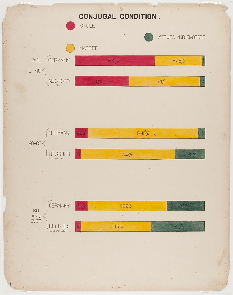
| CONJUGAL CONDITION. | ||||
| Single | Married |
Widowed/ Divorced |
||
|---|---|---|---|---|
| Age 15-40 | ||||
| GERMANY | 62.1% | 37.3% | 0.6% |  |
| BLACK AMERICA | 41.0% | 54.0% | 5.0% |  |
| Age 40-60 | ||||
| GERMANY | 9.6% | 84.8% | 5.6% |  |
| BLACK AMERICA1 | 4.5% | 73.5% | 22.0% |  |
| Age 60 and over | ||||
| GERMANY | 8.2% | 62.2% | 29.2% |  |
| BLACK AMERICA2 | 4.5% | 54.5% | 41.0% |  |
|
1 45-69 2 65 AND OVER
|
||||
Conjugal Condition.
This plate shows the marital status of black Americans, compared to that of Germans. The plate shows clearly that a greater proportion of younger black Americans are married when compared to younger Germans, but older black Americans appear more likely to find themselves divorced or widowed.
Unlike many of DuBois’ graphs, which contain many stylistic elements uncommon in modern data visualisations like spiralling bars and fan charts, this plate shows something quite straightforward. Stacked bars are a very common visualisation, and the horizontal iteration of them is already quite tabular!
Translating to gt was not too difficult. I used colour in the column labels in place of a legend to keep things simple and elegant, and the “groupname_col” argument to collect the different age bins together. DuBois effectively used footnotes to note that the age ranges weren’t quite the same for the black Americans, so I used tab_footnote() to display the same information.
library(tidyverse)
library(gt)

# read data
conjugal <-
  readr::read_csv(
    'https://raw.githubusercontent.com/rfordatascience/tidytuesday/master/data/2021/2021-02-16/conjugal.csv'
  ) |>
  # language
  mutate(Population = str_replace_all(Population, "Negroes", "Black America"),
         Population = factor(Population, c("Germany", "Black America")))

# function to create plot
make_bar <- function(data) {
  data |>
    pivot_longer(-c(Population:Age)) |>
    ggplot(aes(y = "", x = value)) +
    geom_col(aes(fill = name), color = "white", size = 20) +
    scale_fill_manual(
      values = c(
        "Single" = "#953e45",
        "Married" = "#daac2e",
        "Divorced and Widowed" = "#647867"
      )
    ) +
    scale_x_continuous(expand = expansion()) +
    theme_void() +
    theme(legend.position = "none")
}

# create plots
plots <- conjugal |>
  group_split(Age, Population) |>
  map(make_bar)

conjugal |>
  mutate(plot = NA,
         Age = paste("Age", Age)) |>
  relocate(Age) |>
  # use "Age" as group name
  gt::gt(groupname_col = "Age") |>
  gtExtras::gt_theme_538() |>
  tab_header(toupper("Conjugal Condition.")) |>
  # footnotes, as in original plate
  tab_footnote("45-69",
               gt::cells_body(Population, 4)) |>
  tab_footnote("65 AND OVER",
               gt::cells_body(Population, 6)) |>
  fmt_percent(Single:`Divorced and Widowed`,
              scale_values = FALSE,
              decimals = 1) |>
  cols_width(plot ~ px(200),
             Population ~ px(110),
             Single:`Divorced and Widowed` ~ px(90)) |>
  # using colour as a "legend"
  cols_label(
    "Divorced and Widowed" = html(
      "<b style='color:#647867'>W</b>idowed/<br><b style='color:#647867'>D</b>ivorced"
    ),
    "Population" = "",
    "plot" = "",
    "Single" = html("<b style='color:#953e45'>S</b>ingle"),
    "Married" = html("<b style='color:#daac2e'>M</b>arried")
  ) |>
  cols_align("left", Population) |>
  # adding plots
  text_transform(cells_body(plot),
                 function(x) {
                   ggplot_image(plots, height = px(20), aspect_ratio = 8)
                 }) |>
  text_transform(cells_body(Population),
                 function(x) {
                   toupper(x)
                 }) |>
  # format footnotes, adding some space between them and the table
  tab_options(
    heading.align = "center",
    table_body.border.bottom.width = 10,
    table_body.border.bottom.color = "white",
    footnotes.padding.horizontal = 25,
    footnotes.multiline = FALSE,
    footnotes.sep = "     "
  )