openairmaps::networkMap(c("aurn", "aqe", "waqn", "saqn", "ni"), cluster = FALSE)“Put it on a map!”
Developments in Air Quality Data Analysis
Dr Jack Davison, AQ Data Analyst
Ricardo Energy & Environment
April 2023
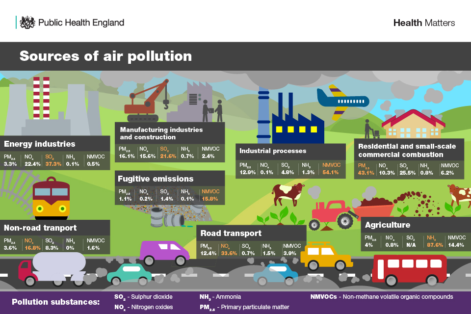
What do we mean by “air quality”?

Source: UKHSA
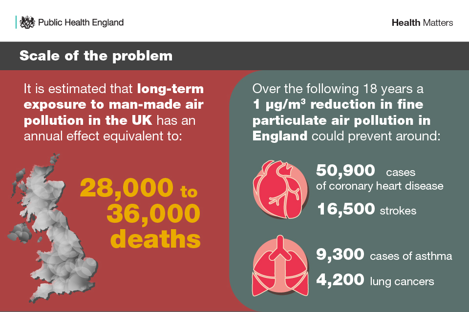
Why do we care?

Source: UKHSA
Measuring air quality
The UK has a lot of air quality measurement sites! We use these to track national compliance with AQ objectives, as well as to inform more local-scale policies.
My role
I am an “air quality measurements data analyst”, but in reality I do a lot of stuff!
As an overall summary, my work is centred around leveraging R to more effectively communicate air quality data to the public.
Authoring “annual reports” in Quarto for different networks, as well as ad-hoc reports (e.g., “episode” reports).
Performing data analysis and creating data visualisations across many different projects.
Developing new tools to better analyse/visualise data (e.g., openair, openairmaps, worldmet, …).
- Facilitate internal & external training to allow others to better understand their own data.

Dynamic Reporting
We create a lot of dynamic reports using rmarkdown (although we’re slowly transitioning to Quarto!).
-
Air quality data lends itself to automatic reporting as it…
…is always in a consistent format (date, pollutant concentrations, met data).
…is added to our databases continuously after ratification.
We also create ad-hoc reports in response to pollution “episodes” (particulate matter episodes on bonfire night, ozone episodes during heatwaves, etc.).
Dynamic reports are an excellent middle ground between traditional reports and data dashboards, providing a strong narrative and extensibility.
The {openair} package
Introduction
openair is an R package developed for the purpose of analysing air quality data — or more generally atmospheric composition data. The package is extensively used in academia, the public and private sectors.
It has been around for a long time — over a decade! This means some things are a bit odd for newer R users (e.g., use of lattice over ggplot2!). Key question - how can we best leverage it in this rapidly developing world of R programming?


The {openair} package
Data Access
Even if you don’t really care about air quality, openair (and worldmet) can still be useful to you as they provide access to lots of timeseries data!
library(openair)
london_data <- importAURN(c("my1", "kc1"), year = 2022, meta = TRUE)
london_data
# A tibble: 17,520 × 17
site code date co nox no2 no o3 so2 pm10
<chr> <chr> <dttm> <dbl> <dbl> <dbl> <dbl> <dbl> <dbl> <dbl>
1 London M… MY1 2022-01-01 00:00:00 0.244 65.4 33.3 21.0 17.2 0.266 18.4
2 London M… MY1 2022-01-01 01:00:00 0.338 117. 43.6 47.6 13.0 1.33 21.3
3 London M… MY1 2022-01-01 02:00:00 0.291 76.7 33.7 28.1 18.8 0.532 25.1
4 London M… MY1 2022-01-01 03:00:00 0.291 90.8 37.5 34.7 21.0 0.798 16.4
5 London M… MY1 2022-01-01 04:00:00 0.244 93.7 33.1 39.5 20.2 0.798 20.3
6 London M… MY1 2022-01-01 05:00:00 0.210 85.3 34.2 33.4 21.8 0.798 8.70
7 London M… MY1 2022-01-01 06:00:00 0.186 63.7 27.3 23.7 21.0 0.266 13.5
8 London M… MY1 2022-01-01 07:00:00 0.210 67.9 31.2 23.9 21.0 0.532 8.70
9 London M… MY1 2022-01-01 08:00:00 0.198 63.1 30.2 21.6 20.8 0.532 14.5
10 London M… MY1 2022-01-01 09:00:00 0.210 73.8 33.3 26.3 23.0 0.532 15.5
# ℹ 17,510 more rows
# ℹ 7 more variables: pm2.5 <dbl>, ws <dbl>, wd <dbl>, air_temp <dbl>,
# latitude <dbl>, longitude <dbl>, site_type <chr>openair book: Accessing UK Air Quality Data
Directional analysis
Univariate
Answers the question “where is the pollution coming from?” 1
openair::pollutionRose(openair::mydata, "nox")
Directional analysis
Bivariate
Answers the question “where is the pollution coming from?” 1
Enter {openairmaps}
Part of the wider “openair toolkit” along with openair, worldmet and deweather.
The purpose of openairmaps was to combine openair’s directional analysis with the leaflet package (& javascript library) to create interactive air quality maps that help us triangulate pollution sources and understand local air quality in its geographical context.
openairmaps::polarMap(openairmaps::polar_data, "nox", popup = "site", d.icon = 300, alpha = 3/4)Package Development
Once I got started, I was hooked! Every time you think you’re done, you’re dragged back in to expand on the functionality further.
Being in the position to teach the package also allows a developer to understand what users are actually interested in.
Case Studies
Trends Over Lockdown
Once nice use of the easy layer control options is to view changes over time. For example, we can clearly see the huge impact of the COVID-19 lockdown in Oxford City Centre!
oxford_road <- importAURN(site = "OX", year = 2018:2022, meta = TRUE)
polarMap(oxford_road, "nox", # data, pollutant
         control = "year", # create control menu for the year
         upper = 20, limits = c(0, 250), # set limits so markers share them
d.icon = 300, alpha = 3/4) # semi-transparencyCase Studies
Source Apportionment
If we have a whole network of sites, we can triangulate potential sources. For example, where are likely sources in a nearby industrial site?
library(dplyr)

# get data
nlincs_local <- importLocal(
  c("SCN6", "SC12", "SC10", "AMVL"),
  year = 2021, meta = TRUE
)
nlincs_aurn <- importAURN(
  c("SCN2"),
  year = 2021, meta = TRUE
)

# combine
nlincs_all <- dplyr::bind_rows(
  nlincs_local, nlincs_aurn
)

# reuse modelled met for local data
nlincs_all <-
  nlincs_all %>%
  select(-ws, -wd, -air_temp) %>%
  left_join(
    select(nlincs_aurn, date, ws:air_temp),
    by = join_by(date)
  )

# polar plot map!
polarMap(
  nlincs_all, "pm10", alpha = 3 / 4,
  # use multiple providers
  provider = c("OpenStreetMap", "Esri.WorldImagery")
)
This is a surface-level analysis of a complex air quality situation - please do not draw any lasting conclusions about Scunthorpe from this map!
Case Studies
24 Hours in Central London
Using different plots as markers can reveal even more interesting features - for example, the polarAnnulus() plot can show how pollution typically varies over a 24 hour period.
london <- importAURN(site = c('CLL2', 'MY1', 'KC1'), year = 2019, meta = TRUE)
annulusMap(london, d.icon = 300, c("nox", "pm10", "so2"), # multiple pollutants!
           provider = "CartoDB.Positron", # just to demo - a different provider
cols = "viridis") # and a different colour paletteHow does this work “under the hood”?
The {leaflet} package
The leaflet package makes it really easy to construct interactive web maps. Look closely around the web and you’ll find leaflet maps everywhere. An example of a map is shown below.
library(leaflet)

oxford <-
  data.frame(
    lat = c(51.754474, 51.758900),
    lng = c(-1.260699, -1.259626),
    label = c("White Rabbit Pizza Restaurant", "Department of Statistics"),
    popup = c("Where all the tasty pizza comes from!", "The home of OxfordR!")
  )

leaflet(oxford) %>%
  addTiles() %>%
  addMarkers(lat = ~lat,
             lng = ~lng,
             label = ~label,
             popup = ~popup)
How does this work “under the hood”?
The {openairmaps} way
leaflet::makeIcon() function can create leaflet markers out of effectively any image.
We save the openair plots in a temporary directory first, and then point makeIcon() at these images.
Everything is contained in a nested dataframe so everything remains properly aligned!

Future Directions
Every time I think openairmaps is “done”, something new comes along!
Could trend analysis be better “baked in” to openairmaps to more easily compare AQ trends?
Is there space for more straightforward maps, like “spot concentration” or DAQI maps?
Are there any leaflet extensions that we could make use of? e.g., leaftime
Potential future directions in the openair world?
Proper ggplot2 implementations of openair plots to allow for more customisation - a big refactor like that is hard work, however!
Interactive (e.g., plotly) implementations of openair plots, given the growth of dynamic reporting.
Something in the tables space - had an early attempt a few years ago but could it be expanded/packaged up?
“Put it on a map!”
Developments in Air Quality Data Analysis
Dr Jack Davison, AQ Data Analyst
Ricardo Energy & Environment
April 2023


